Dashboard
Learn how to track all your mobility metrics on one screen using Vianova's Dashboard.
See it in action: Watch the video below for a guided tour on how to use the dashboard.
/
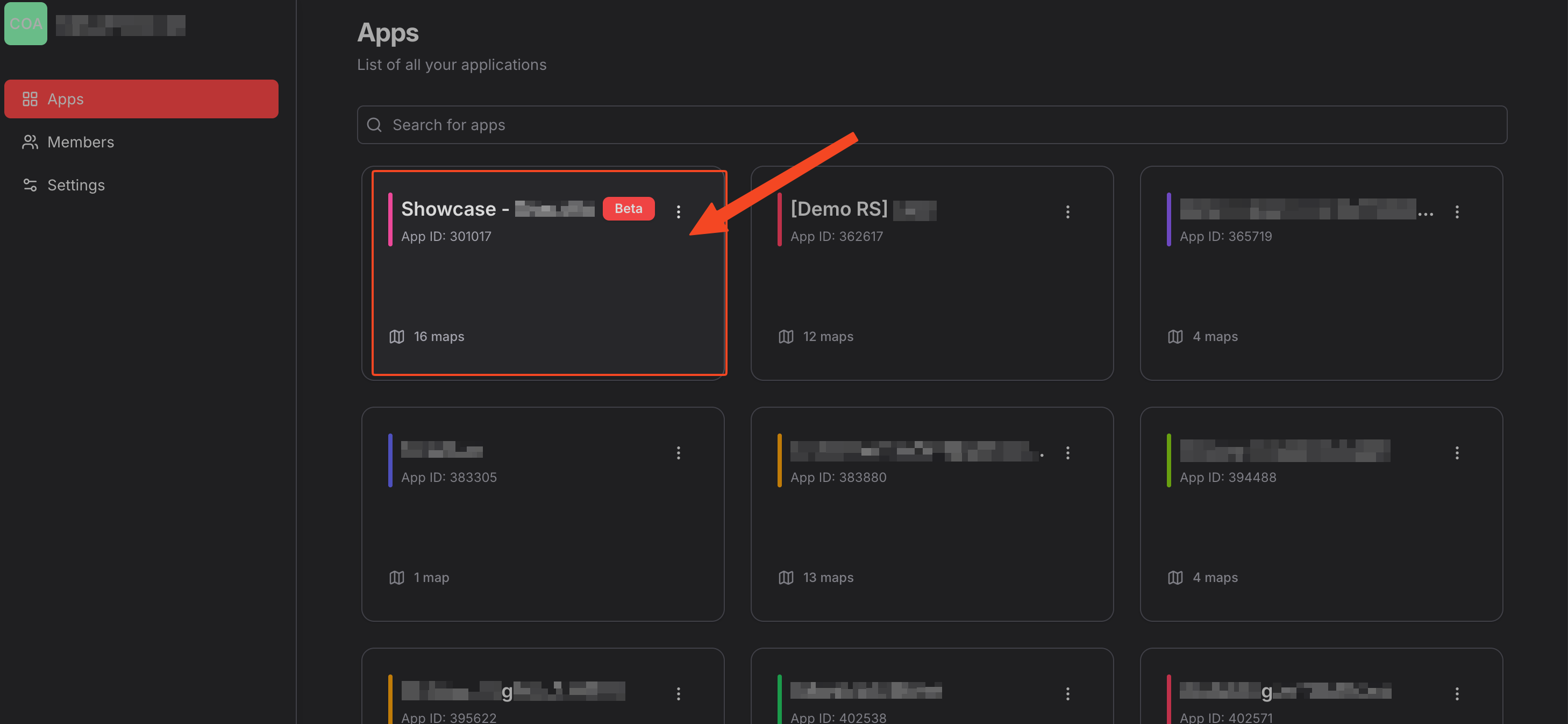
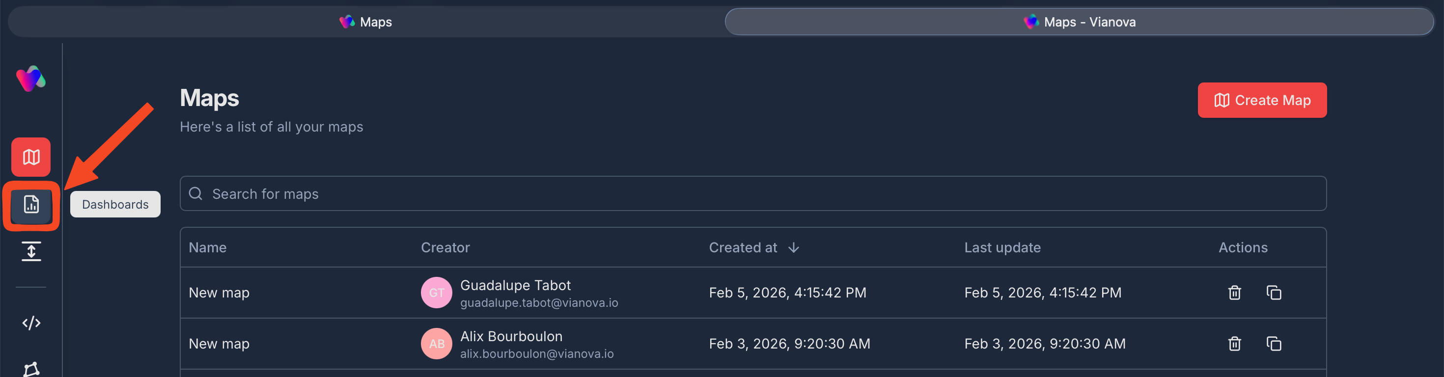
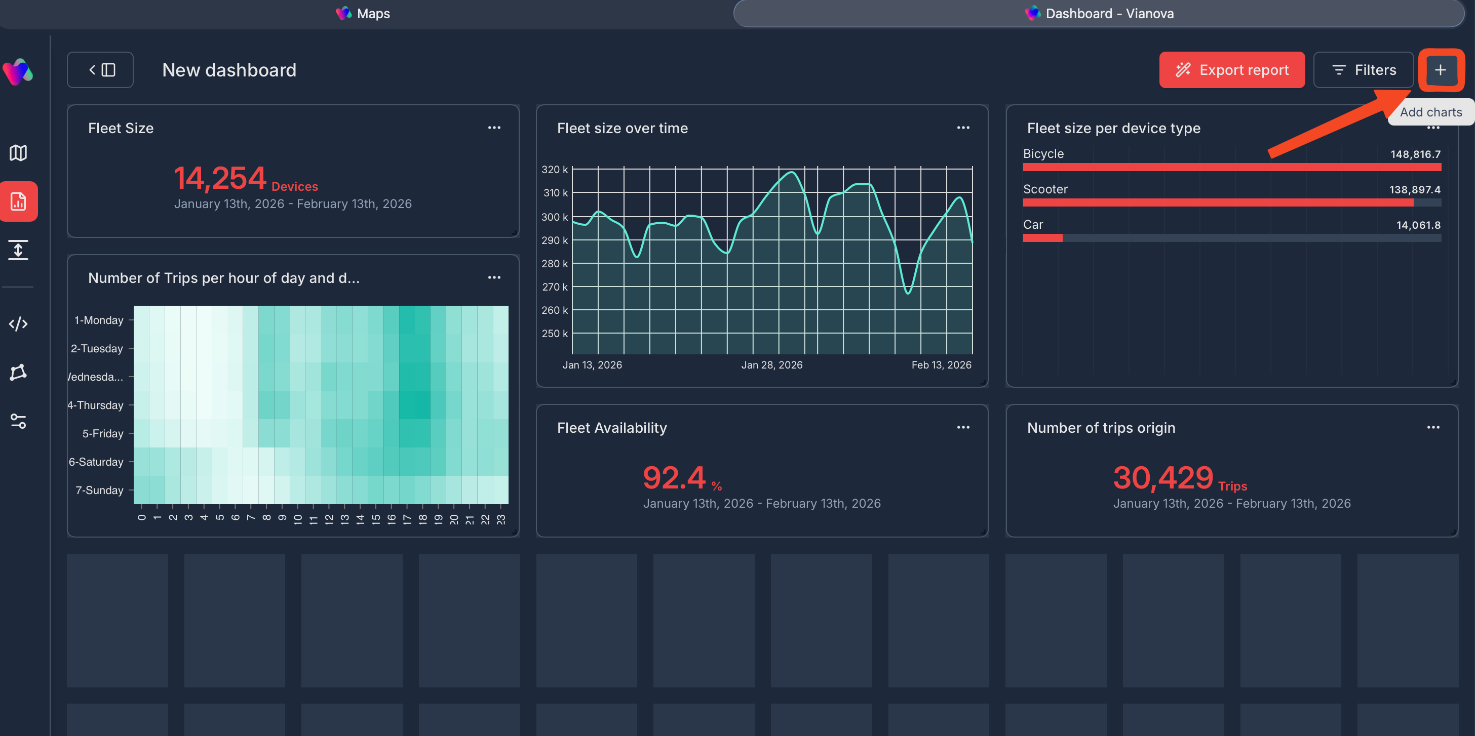
Access Dashboards
Purpose: Switch between exploration (Maps) and performance tracking (Dashboards) to monitor your key mobility metrics
How to Access:
- Click the Dashboards icon (📊) in the left navigation bar
- View your complete list of dashboards with creator, dates, and actions
- Use search bar to quickly find specific dashboards
- Click Create Dashboard button to start building
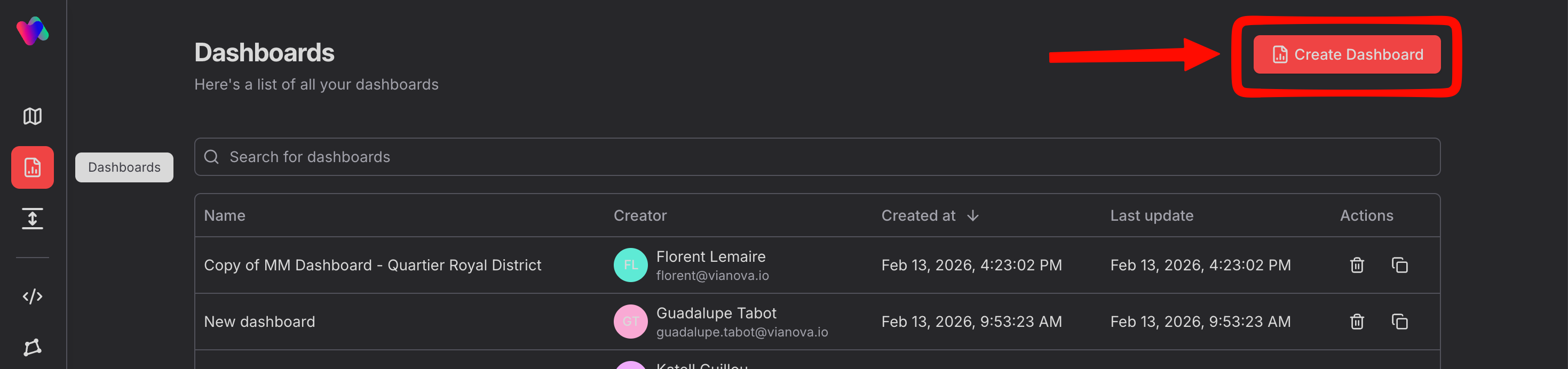
Create Dashboard
Purpose: Build a centralized view combining multiple data sources and metrics in one organized space
Step-by-step Process:
- Click Create Dashboard button in top-right corner
- Start with a blank canvas
- Set global filters (Date range, Zone) in left panel for dashboard-wide consistency
- Begin adding charts via the + button (top-right) or center create a new chart button
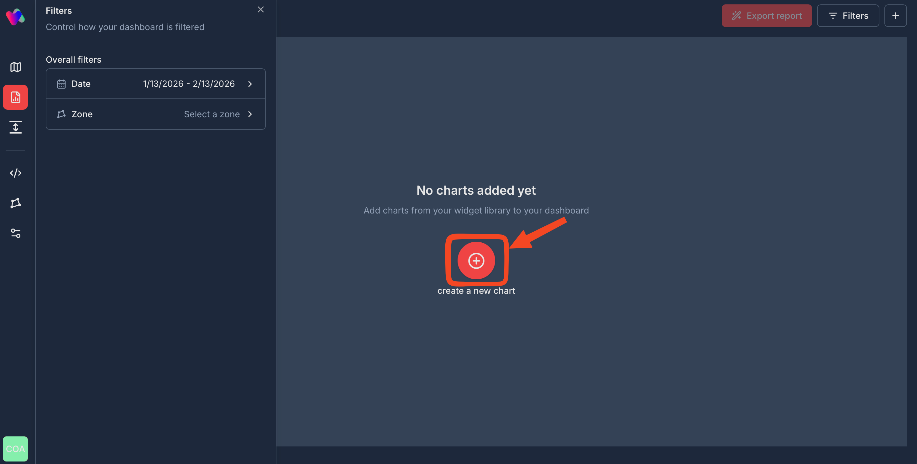
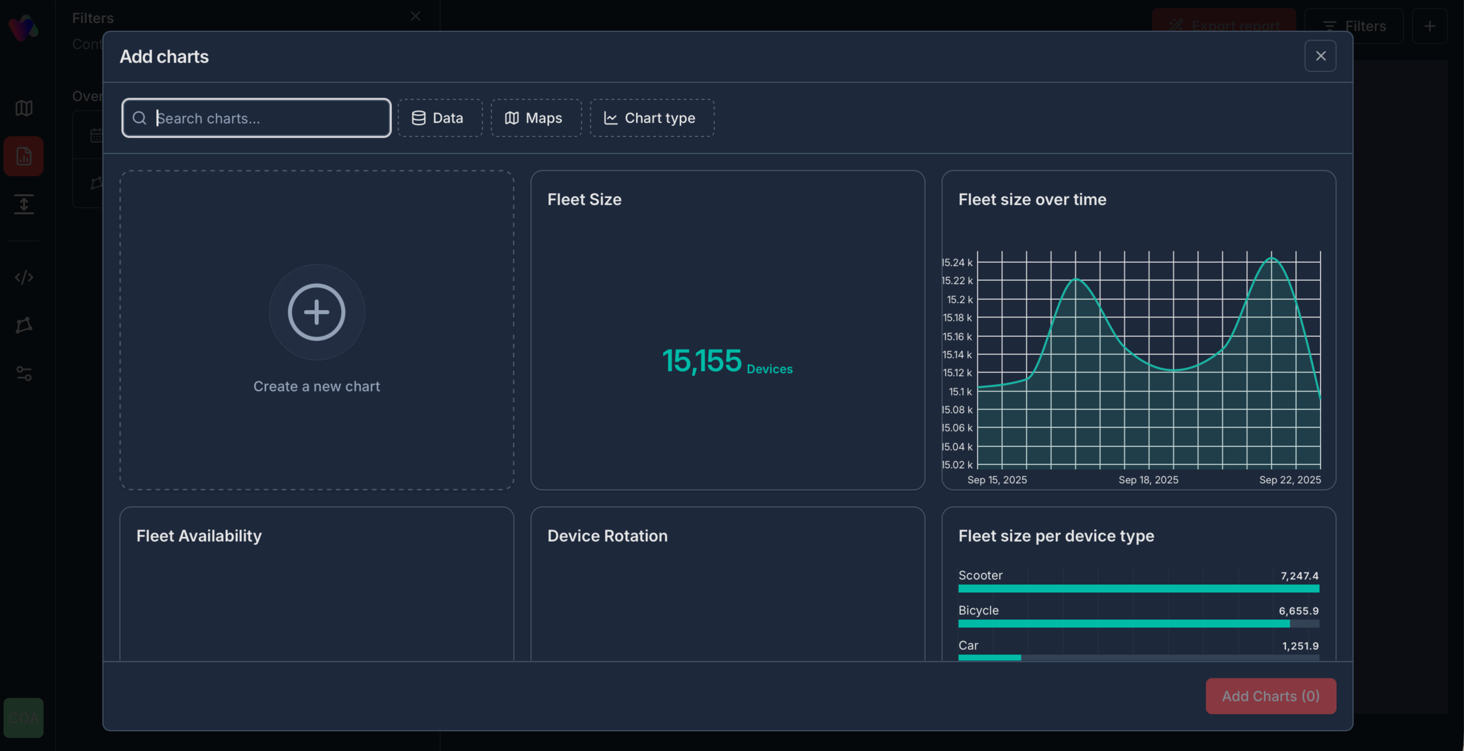
Add Charts from Widget Library
Purpose: Reuse existing charts from saved maps to build dashboards faster without recreating analysis
Step-by-step Process:
- Click Add charts button (‘+’ icon in top-right or center of empty dashboard)
- Widget Library modal opens showing all available charts
- Filter options:
- Search bar: Find charts by name
- Data: Filter by data source
- Maps: Filter by saved map name
- Chart type: Filter by visualization type
- Select charts by clicking on them (checkmark appears when selected)
- Click Add Charts (X) button at bottom-right
- Selected charts instantly appear on your dashboard

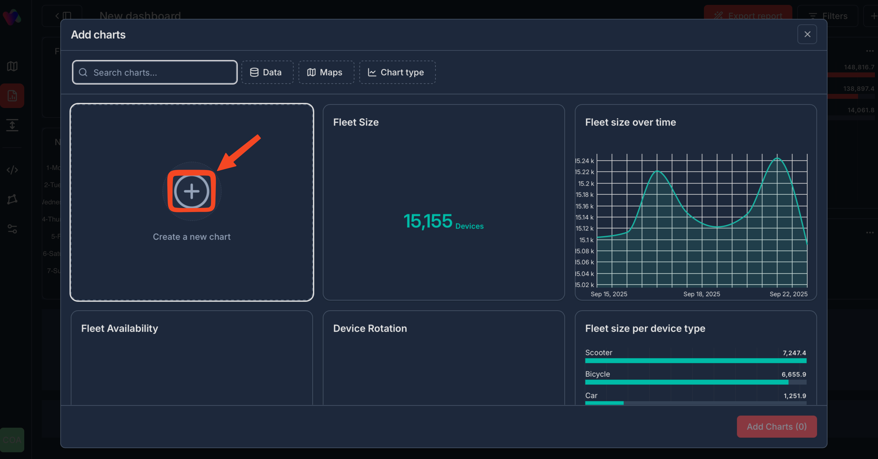
Create New Chart
Purpose: Generate custom visualizations using suggestions tailored to your data
Step-by-step Process:
- From Widget Library, click Create a new chart (+ icon card)
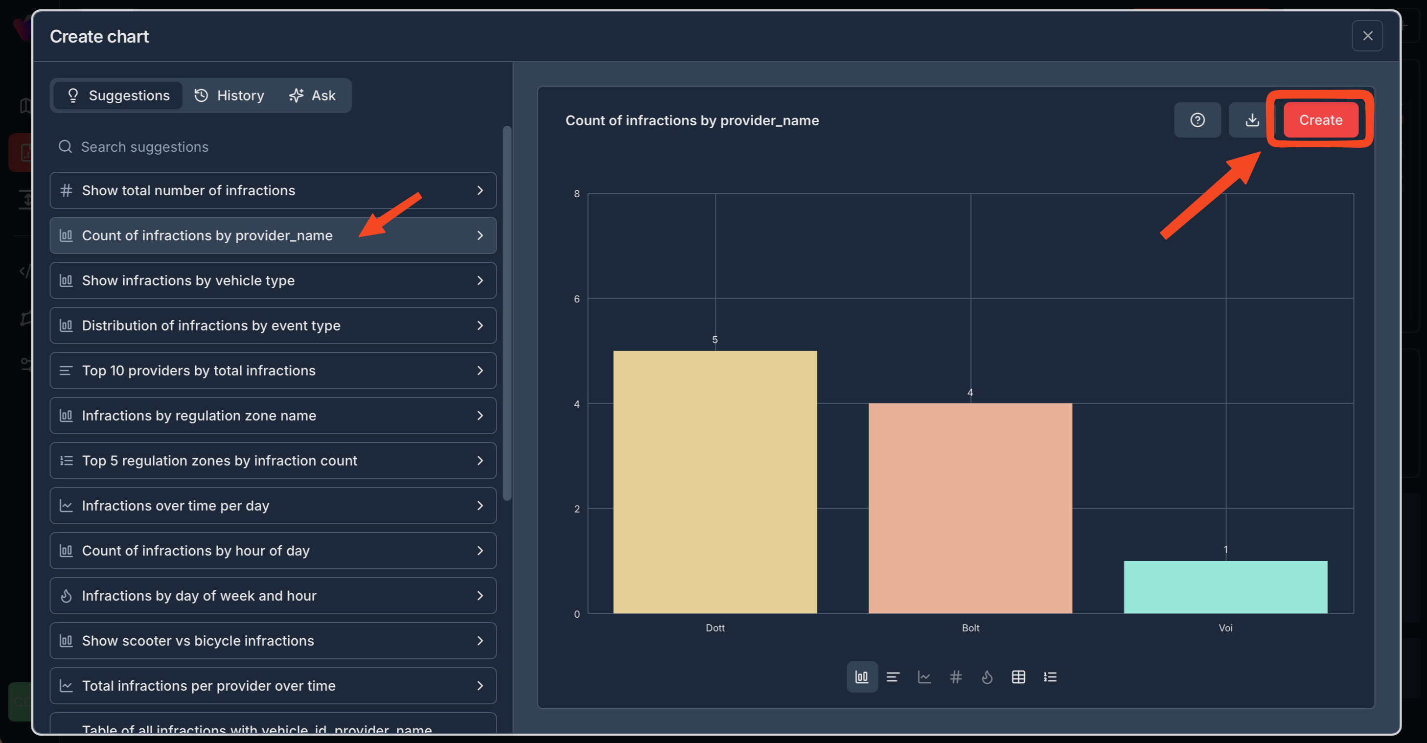
- Create chart modal opens with three tabs:
- Suggestions: AI-recommended charts based on your data
- History: Previously created charts
- Ask: Natural language chart creation
- Browse suggestions or search for specific analyses
- Click on any suggestion to preview the chart in real-time
- Click Create button (top-right) to add chart to Widget Library
- Chart is now available to add to any dashboard
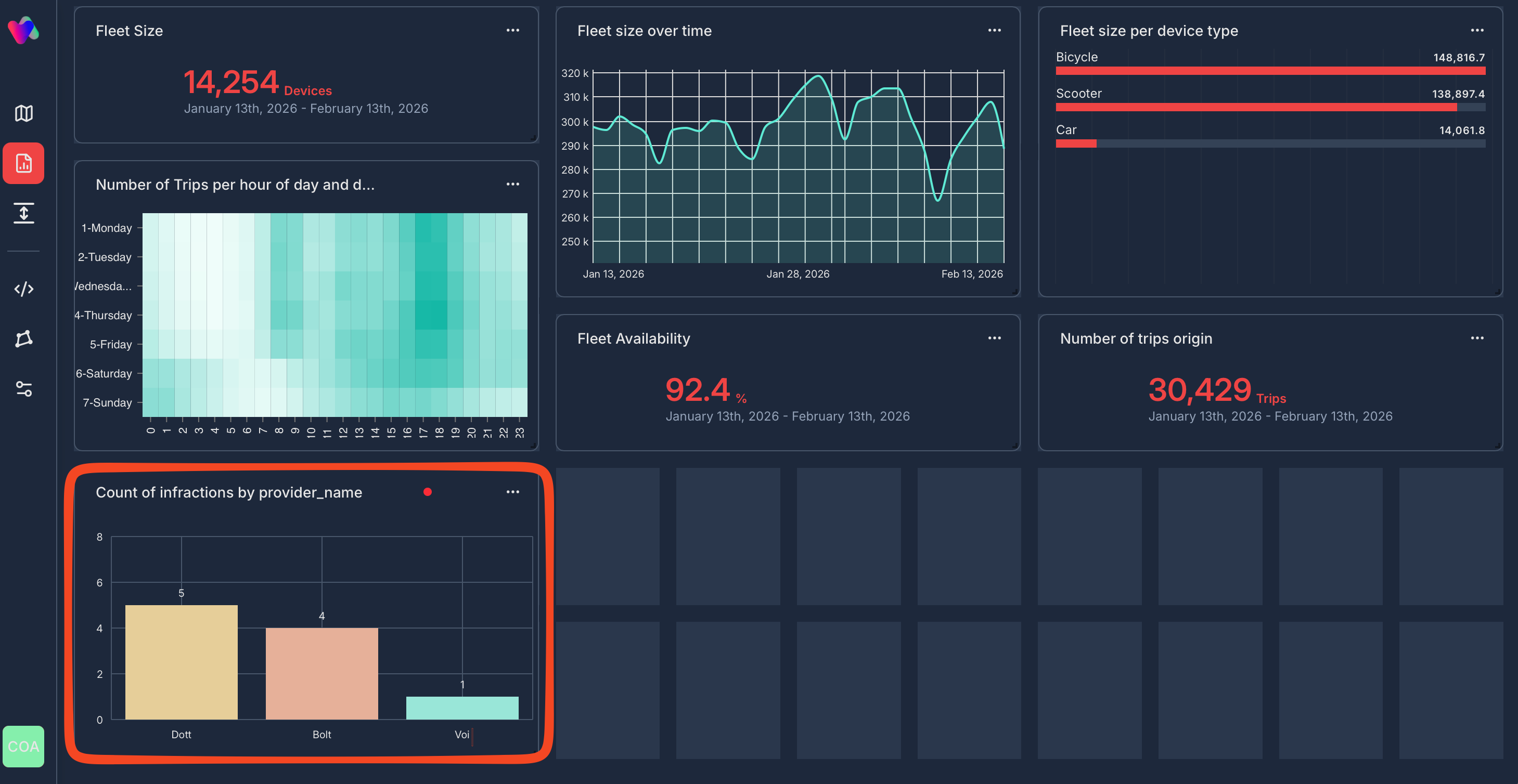
Organize Dashboard
Purpose: Customize layout for optimal readability and stakeholder presentation
Dashboard Management:
- Drag & drop: Move charts to reposition
- Resize: Drag chart corners to adjust size
- Delete: Click three-dot menu (…) on any chart → Delete
- Edit: Click three-dot menu (…) → Edit chart settings
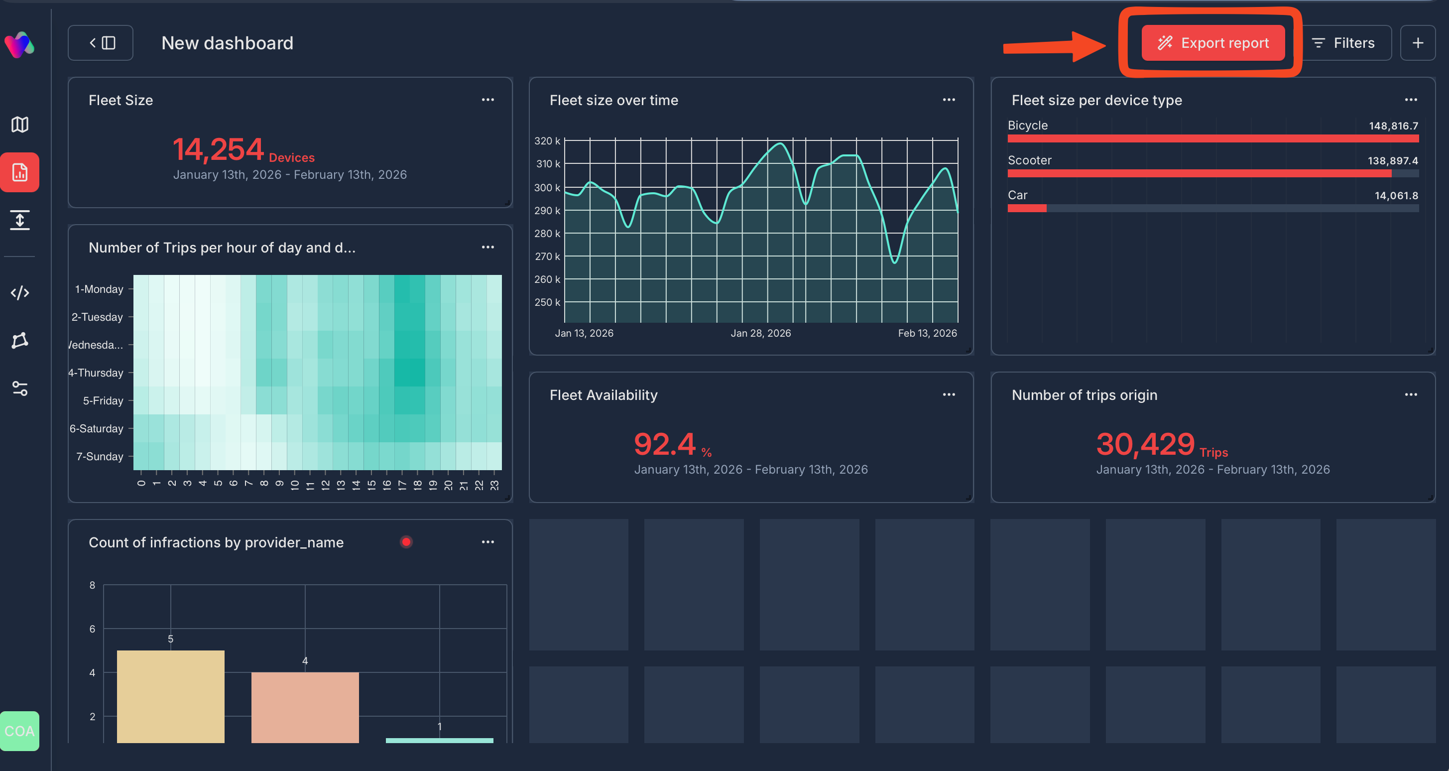
Export Dashboard
Purpose: Share comprehensive multi-stream reports with stakeholders as professional PowerPoint presentations
Export Process:
- Click Export report button (top-right, red button)
- System generates PowerPoint with:
- All visible dashboard charts
- Applied filters and date ranges
- Multi-sources data combined in one presentation
- Text analysis of the metrics
- Download and share with stakeholders
Quick Tips
✅ Start with Widget Library: Reuse existing charts to save time
✅ Set global filters first: Ensure consistency across all charts
✅ Use AI Suggestions: Discover insights you might have missed
✅ Organize for your audience: Put key metrics at top for executives
✅ Export regularly: Keep stakeholders informed with consistent reporting
Need help? Contact Vianova help center: [email protected]
Updated 5 months ago