Graph & Widgets
Graph & Widgets enables intelligent visualization creation through natural language queries, allowing users to generate insightful charts and analytics by simply asking questions about their mobility data set.
Overview
The Graph & Widgets feature transforms how users create data visualizations by allowing them to ask questions in natural language and automatically generate appropriate charts. This powerful functionality eliminates the complexity of traditional chart creation, making data analysis accessible to users regardless of their technical expertise.
Creating Charts and Widgets
Follow these steps to create custom visualizations in VIP: Demo - Create a graph using the VIP
Step 1: Select a Data Layer
- Click on a data layer in the left sidebar to activate it
- The data will be displayed on the map and become available for visualization
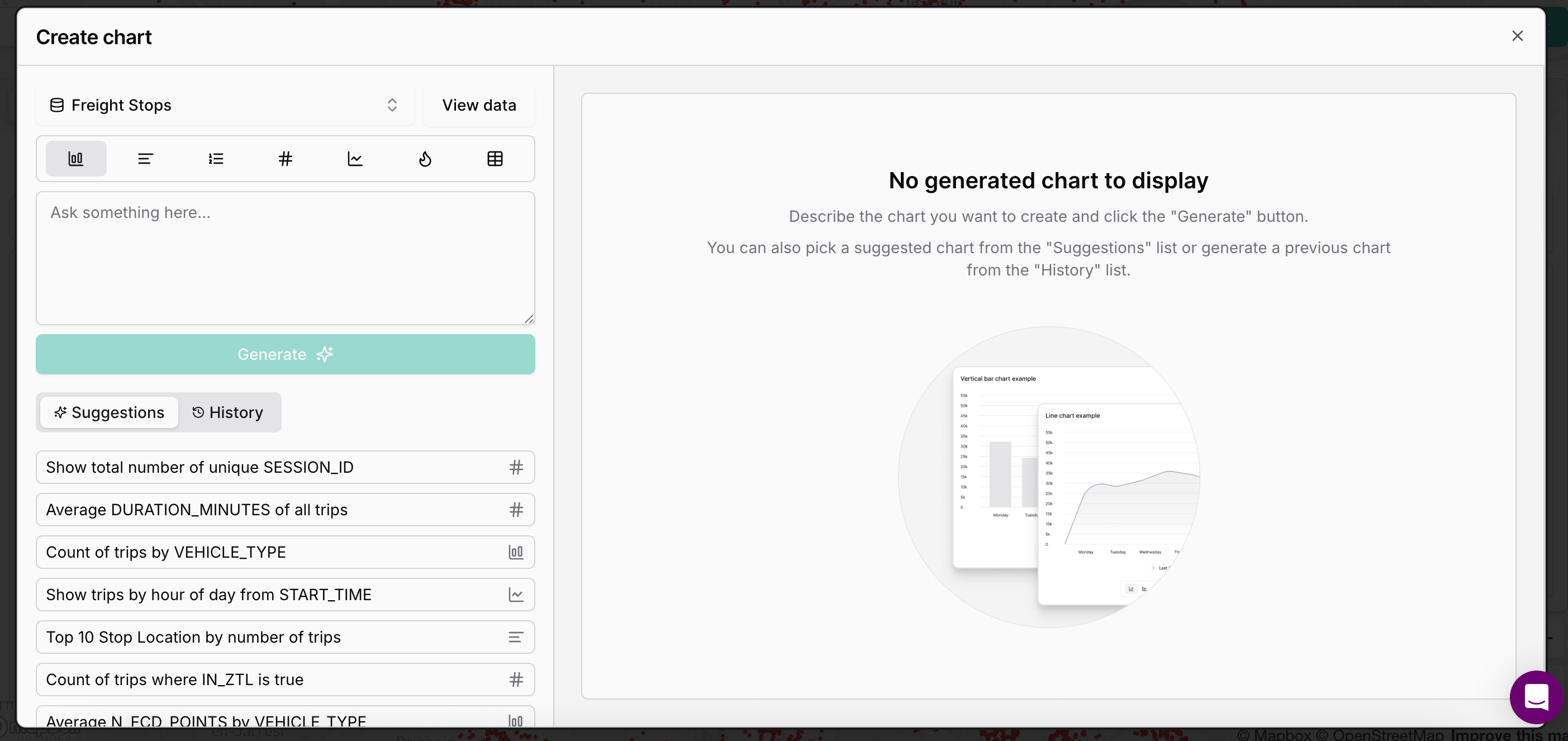
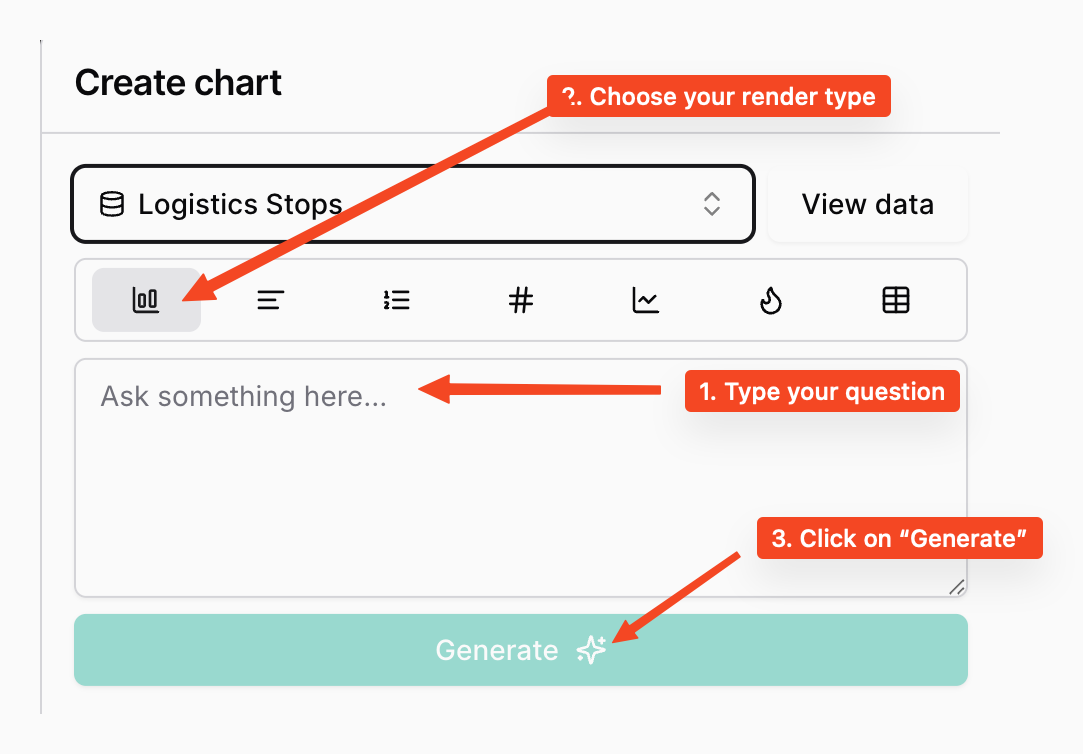
Step 2: Add a New Chart
- Click on the "+" button in the Charts panel on the right side of the charts
- This will open the chart creation interface
Step 3: Generate a Chart Using AI
The VIP platform offers an innovative AI-powered chart generation feature:
- After clicking the "+" button, you'll arrive at the chart creation page
- Use the text field to write a prompt describing the visualization you want
- Choose a render style (Bar chart, Line chart, etc.) using the dropdown selector
- Click the send button to generate the graph
- You can check a sample of the data by clicking "View data" if needed
Step 4: Customize Your Chart
- Once generated, you can give a title to your widget
- Click "Generate the widget" or "Create chart" to finalize
Step 5: Add to Your Dashboard
The new chart will appear in your Charts panel, where you can:
- Resize it by dragging the corners
- Reposition it by dragging the header
- Access additional options via the "..." menu
Two Creation Methods
Write a question (Natural Language Prompts)
Purpose: Ask custom questions about your data in plain text language
How it Works:
- Type questions directly about your dataset
- Platform interprets the query and analyzes data structure
- User selects preferred visualization type
Types of Visualizations
VIP supports various visualization types to suit different analytical needs:
| Chart Type | Description |
|---|---|
| KPI | Highlighting single important metrics or goals |
| Bar Chart | Comparing values across categories |
| Bar List | Ranking items by value with horizontal orientation |
| Rank | Creating ordered lists based on performance metrics |
| Line Chart | Showing trends and changes over time |
| Heatmap | Visualizing data density and identifying hotspots |
| Table |
Smart Suggestions
Purpose: Use pre-generated intelligent recommendations
How it Works:
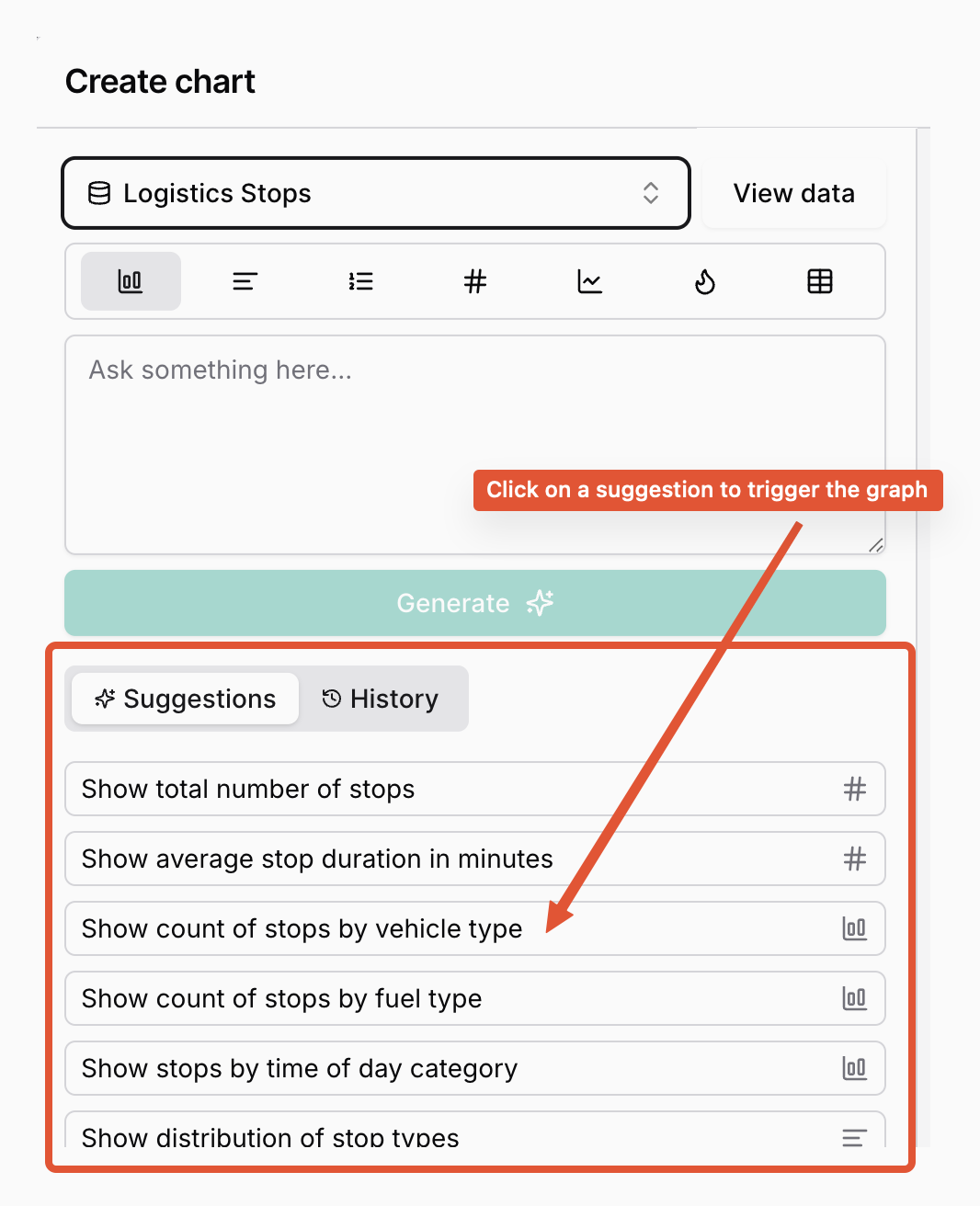
- Platform analyzes your dataset characteristics
- Generates relevant question suggestions automatically
- Pre-selects optimal visualization type
- One-click chart creation
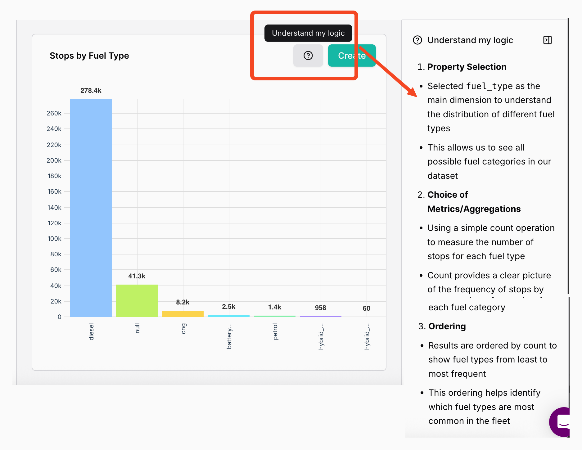
"Understand My Logic"
Purpose: Build confidence in generated visualizations levraging transparency on the output
Error Handling and Guidance
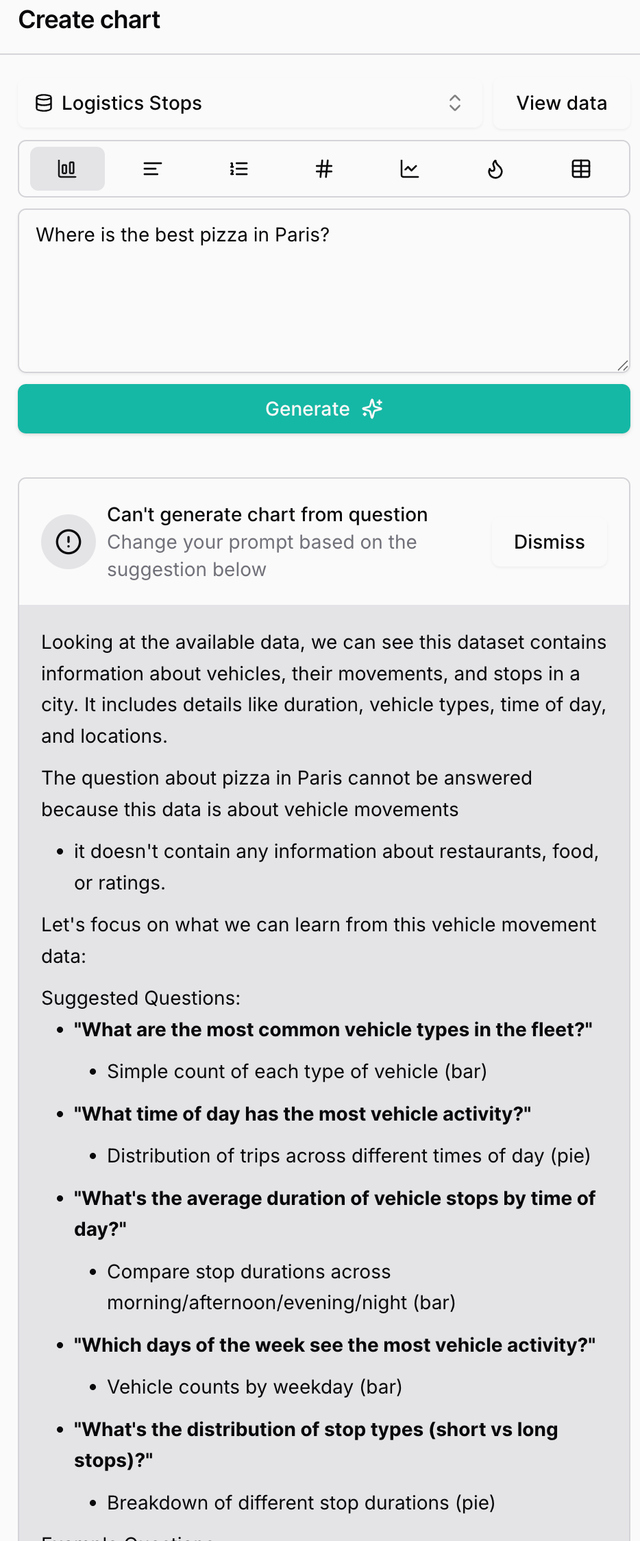
When questions cannot be answered based on dataset:
Example Scenario (from transcript):
- User Question: "Where is the best pizza in Paris?"
- System Response: Cannot generate chart for this question
- Explanation: Dataset contains trip information, not restaurant data
- Alternative Suggestions: Provides relevant questions that can be answered with available data
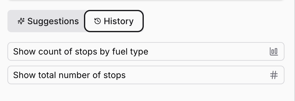
Query History
Purpose: Historical Question Tracking
Functionality: Access history of all previously asked questions
Updated 8 months ago